Don’t Mistake Legibility for Communication – Analysis
| ✅ Paper Type: Free Essay | ✅ Subject: Design |
| ✅ Wordcount: 3417 words | ✅ Published: 29 Aug 2017 |
CRITICAL STUDY IN
ART & DESIGN
DON’T MISTAKE LEGIBILITY
FOR COMMUNICATION
David Carson | Discuss


It is the art director, graphic designer and surfer David Carson (b. 1954) who stated during his 2013 TED Talk, ‘Don’t mistake legibility for communication’. Since making this statement, designers have had to rethink what it means to communicate; especially when attempting to interact and engage with their target audience. However, is Carson’s statement true? As it can be argued that legibility is the basis for something to not only be readable but also understood and therefore communicated. Conversely, if communication is the goal then the aim is more than just making something legible. Therefore, this discussion will explore and present arguments for and against the statement Carson made, define and explain the terms legibility and communication, and to document the social and historical context behind Carson’s statement to establish whether it was valid or not.
To begin, when something is being communicated it can be received by the audience visually, verbally, nonverbally or in its written form. The field of a Graphic Designer is visual communication as they attempt to incorporate, or least infer these elements through their designs. For that reason, visual communication or more specifically, production in print, will be the focus for this discussion as that is what Carson’s statement pertains to.
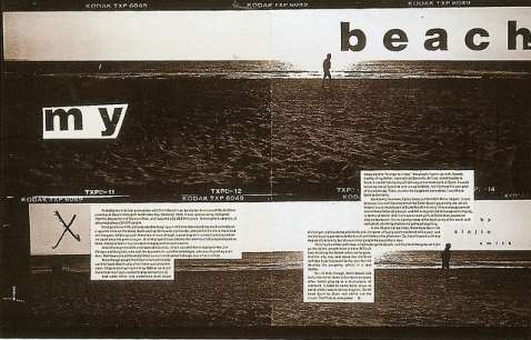
In regards to Carson’s statement, the word legibility is mentioned. This word can be simply defined as ‘how recognisable individual letterforms are’ (Tselentis, J et al. 2012 p. 324). In a segment of Carson’s 2003 ‘Design And Discovery’ TED Talk, he presents the following image with his statement:
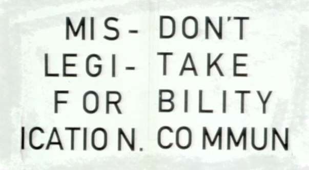

Carson then goes on to say the following about his image (Figure 2) and gives his opinion about the statement in regards to legibility and communication, where he states,
I like this [image] for a couple of reasons. If you’ve had any design courses, they would teach you can’t read this. I think you eventually can and, more importantly, I think it’s true. “Don’t mistake legibility for communication”. Just because something’s legible doesn’t mean it communicates. More importantly, it doesn’t mean it communicates the right thing (Carson 2003).
As Carson suggests (2003) the primary goal of the designer is to communicate a message. However (in his own words) more importantly, it is to communicate the right thing. The question to then be considered is to ask what communication is in the first place? John DiMarco (b. 1963) in his book ‘Digital Design For Print and Web’ (2010) explains that communication is a process, in which, ‘. requires a sender (the designer), a message (information or an effort to persuade), a medium (the delivery platform), and a receiver of that message (the audience).’
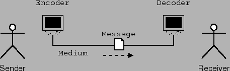

Here, it can be understood that during the communication process it is the designers’ job to send a message. DiMarco (2010) then states that, ‘the goals of such messages are to inform, to persuade, to educate, or to entertain.’Â The designer having a communication goal in mind then uses the message and medium to reach their audience. Bearing this all in mind, we are then left to ask why is communicating the right thing so important to Carson? In the 2007 Helvetica documentary, Carson states,
Don’t confuse, legibility with communication. And just because something’s legible, doesn’t mean it communicates, and more importantly doesn’t mean it communicates the right thing. And vice versa. If something is a very important message, and it’s said in a boring, nondescript way, then the message can be lost (Carson 2007).
The goal for Carson then seems to be that is must communicate the right thing – otherwise known as effective communication. The message cannot be lost through the medium. Which would then leads to the message not being received by the anticipated audience. Nevertheless, what is effective communication and how does it differ from regular communication? The difference seems to lie in the way something is communicated. It can be argued, (as Carson seems to) therefore, that this is just as important, if not more important than the content of the message itself.
This point is noted by Art Director and Graphic Designer Kaitlyn Wells (b. 1988) who suggests (2011) to communicate does not mean the designer has to send a message which is merely legible. As for Wells, legibility in itself does not equate to communicating effectively. In her blog post ‘Don’t Mistake Legibility for Communication’ Wells writes,

Just because you can read it, doesn’t mean it is communicating the intended message. David Carson is famous for his crazy typography and his ability to connect emotion, design and key messages in an effective, impactful way. Some of it is legible, some of it is not, but all of it delivers a message (Wells 2011).
Here, Wells makes the distinction between legibility and effective communication, noting how important it is to make sure that the audience actually receives the message through the emotion behind it and not just the content of the message itself. For Carson, it is not sufficient for something to merely be legible, as it is only one of the potential tools that can be used to achieve the end goal of communicating a message.

Carson seems to be able to attract his intended audience in such a way that he not only gets his message across but manages to emotionally connect and engage with them as well. In ‘The Emotion Thesaurus’ (2012)Ackerman and Puglisi state that the sole reason people pick up a printed production is ‘. to have an emotional experience. They read to connect…’It can be argued that this is the same communication goal of Carson too.
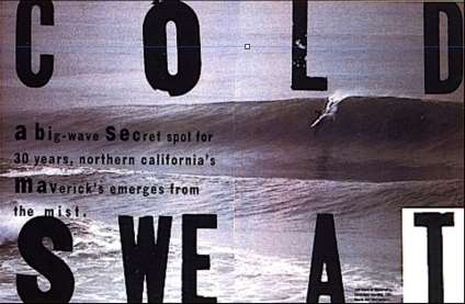
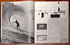
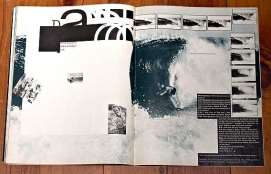
This can be further demonstrated through some examples of Carson’s designs in the ‘Ray Gun’ publication (1992) which Carson was the art director of:

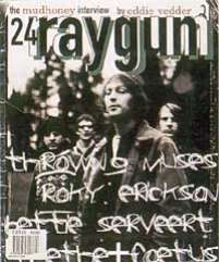
According to DiMarco (2011), after Carson was appointed Art Director for the Ray Gun publication its circulation tripled, emphasising the effectiveness of Carson’s designs. DiMarco then states that the magazine was created as ‘an anti-glossy, anti-establishment manifesto that became a synonym of rock & roll, rebellion and alternative spirit.’ This was the audience that Carson was attempting to reach. Therefore, the layout design needed to not only reflect this but to find a way to effectively communicate and connect with his audience as well.
 In Carson’s TED Talk he speaks about the following car garages (see figure 6):
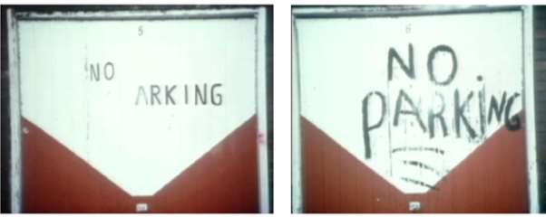
Here Carson points out that the two car garage doors displayed (see Figure 6) are both legible and communicate the same message. However, the way the message is communicated is different. As it can be seen that the garage to the left is legible and the message is clear NO PARKING. Stylistically the way that this message has been presented would likely be seen as generic, informative and neutral.
Conversely, it could be argued that the garage to the right gives the reader a different feel as the message would likely be interpreted in a different manner to the garage on the left. As the garage to rights with its NO PARKING message has a bold and humanistic style which seems to give it a different tone to the intended viewer. Although it could be argued that this is unintentional the feeling seems to persist nevertheless. The underlining of the same NO PARKING message seems to emphasise the gravity of what is being communicated. All of these stylistic elements add to the way the message is intended to be received by transmitting through the text the emotion of the message.
Moreover, other examples of text being written in capitals tend to convey the emotion of anger and often transmits the message of somebody shouting; which in both cases demands that the message being communicated is to be taken seriously as it has been delivered in a direct and effective manner.
Carson (2003) himself then goes on to explain about the garage doors in the following way,
I’m a big believer in the emotion of design, and the message that’s sent before somebody begins to read, before they get the rest of the information. That area of design interests me the most. These are a couple of garage doors painted identical, situated next to each other. So, here’s the first door. You know, you get the message. You know, it’s pretty clear. Take a look at the second door and see if there’s any different message. O.K, which one would you park in front of? Same colour, same message, same words. The only thing that’s different is the expression that the individual door-owner here put into the piece and, again, which is the psycho-killer here? Yet it doesn’t say that; it doesn’t need to say that. I would probably park in front of the other one (Carson 2003).
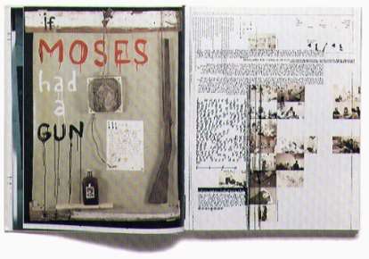
For Carson’s own designs, it seems his focus is on the way he communicates his message. Carson appears to designs his layouts intuitively to create a visceral reaction and response. His designs must connect with his audience emotionally for them to be effective and even if the content of the message cannot do this alone then the way the message has been designed will help the communication process of achieving Carson’s communication goal. This can be seen in his designs for ‘The Book Of Probes’ by Marshall McLuhan.

Whilst it may seem that Carson’s statement cannot be refuted there have been those that have done so. One example of someone that has vehemently disapproved Carson’s methodology, is design writer Joe Clark. In his article titled ‘Illegible David Carson cannot communicate’ originally published in the Globe and Mail (1995), Clark writes that,
Typography is supposed to be invisible. If the intended reader actually notices the typography and graphic design on a page, then you’ve failed as a designer. The goal of communication is achieved only when typography does not “distract” (Clark 1995).
This line of thinking was influenced from Beatrice Warde’s (b. 1900) lecture titled, ‘The Crystal Goblet‘, or ‘Why Printing Should Be Invisible’ (1930). Both Clark and Warde’s focus is on the content of the message and that the legibility of the message detracts from what is trying to be communicated. Otherwise, the message can be distorted where the information that is trying to be communicated is not what was originally intended.
DiMarco (2011) notes how Carson, ‘broke the rules in every way. including negative leading, overlapping, layering, and creating absurd compositional layouts, such as backwards text settings and columns of texts that bled off the page or aligned or overlapped each other.’ This can be seen in below (figure 8).

In Noah Read’s article (2009) in regards to Warde’s lecture he notes that,
Warde asserts that the purpose of written text is thought transference and any type that does anything to distract from that goal is a failure in its purpose. Type is there to illuminate the thoughts and ideas contained in the written word (Read 2009).
Here, Read highlights how Warde deems anything that detracts from the content of the message to be a failure in its purpose. In relation to Carson, this would be a failure in his attempt to communicate with his audience. For Warde, the text used in the message should only be implemented to aid the content and the content alone. However, as mentioned earlier, Carson has demonstrated that he arranges the type to effectively communicate rather than to merely share the content alone.
For Clark, in his article he rebuked the Ray Gun publication by noting that,
Every single typesetting rule of thumb you could possibly come up with has been broken in Ray Gun’s brief history: Overlapping blocks of copy; light text against dark backgrounds; dark text against dark backgrounds; running text across pages, including stories that are read horizontally across columns (just hop over the gutter between them); deliberately running photos upside-down (Clark 1995).
 For Clark it seems as if he felt Carson’s, ‘Don’t mistake legibility, for communication’ statement was taken to the extreme where because both the message was legible and the audience could misinterpret its intended point too through the way it was designed; then for Clark surely the communication and intended message failed, as the design was illegible in its content and ‘missed the mark’ in its execution.

However, this assertion of Clark’s is subjective at best and judging by the sales of the Ray Gun magazine it is presumptive at worse because as mentioned before the publication sold many copies to those prior to Cason design. Additional to this point, it was the philosopher and Professor Marshall McLuhan (b. 1911) who wrote in his book ‘Understanding Media: The Extensions of Man’ (1964) that, ‘the medium is the message’. By this, he meant that it is the form of the medium, not the content of the message or even the message itself that is most important. An example, which could argue how Carson supports this theory is where he employs a similar idea into one of his articles for the Ray Gun magazine publication where he uses the Zapf Dingbat typeface.

In regards to Carson using the Zapf Dingbat typeface, he states in an interview with Design Boom (2014) that it was one of his favourite briefs. During the interview he shares,
We had a new writer from a much bigger music mag, and I was really excited to read this article when it came in. but I was really disappointed to find it was like sooo many others: the writer had been given 10 minutes before the performer went on stage to do his entire interview, and as such he reported the typical stuff like what the singer was wearing, what was in the room etc. boring stuff I’d read so many times before. I started going through my fonts, finding nothing that felt right, then came across dingbat. Which would have been the last one on my very extensive list, as it’s known by the designers name zapf dingbats. I’m sure I chuckled a bit, then thought, well, why not? It was a really boring article. So the entire article was set in zapf dingbat (Design Boom 2014).
This exemplifies that for Carson communicating his work was more than using words alone but even the piece itself could be communicated through the medium rather than with merely the content. Especially if the content served no purpose in taking the reader on an ’emotional journey’ It could be inferred that the purpose the Zapf Dingbat that was to do precisely that – to bring excitement, joy and humour to what would have been a boring, dull tedious article.
David Carson’s statement (2003) ‘Don’t mistake legibility for communication’ is both challenging and thought-provoking. As stated beforehand, not all designers would agree with Carson’s evaluation of effective communication. As Carson’s statement seems paradoxical at first but when understood in its proper context it appears to be congruent when seen in light of his work. However, when compared with traditional teachings and lectures as to how typography in publications should be treated, it can be argued that the designer could fail in making his or her work both illegible and even worse this may lead to the message of the designer not communicating its desired effect too. Nonetheless, to confine communication to only being something that can be achieved through legibility in content only takes away from what effective communication can be. Taking this into consideration, despite his critics and given his numerous supporters, it is still justifiable to argue that Carson has made a salient point in the Graphic Design world; as it is still relevant today as it was when he first stated it. Consequently, it can be strongly argued that it renders Carson statement, ‘Don’t mistake legibility for communication’ as valid.
Reference List
Books
- Tselentis, J., Haley, A., Poulin R., Seddon T., Leonidas G., and Saltz I. (2012) Typography, Referenced: A Comprehensive Visual Guide to the Language, History, and Practice of Typography. Beverly, MA: Rockport Publishers.
- DiMarco, J. (2010) Digital Design for Print and Web: An Introduction to Theory, Principles, and Techniques. Hoboken, New Jersey: John Wiley & Sons.
- Ackerman A., and Puglisi B. (2012) The Emotion Thesaurus: A Writer’s Guide To Character Expression. Seattle: CreateSpace Independent Publishing Platform.
Websites
- Wells, K. (2011) Don’t Mistake Legibility For Communication. Available at: http://www.stokefire.com/2011/06/dont-mistake-legibility-for-communication/ (Accessed: 15 December 2016)
- Clark, J. (2011) “Illegible” David Carson cannot not communicate. Available at: http://joeclark.org/design/davidcarson.html (Accessed: 13 February 2017)
- DiMarco, D (2011) David Carson. Available at: http://www.csun.edu/~pjd77408/DrD/Art461/LecturesAll/Lectures/PublicationDesign/DigitalTimes/Davidi-Carson.html (Accessed: 12 February 2017)
- Noah, R (2009) Graphic Design Theory: The Crystal Goblet. Available at: https://noahread.net/blog/graphic-design-theory-the-crystal-goblet (Accessed: 12 February 2017)
- Design Boom (2014) Interview with Graphic Designer David Carson. Available at: http://www.designboom.com/design/interview-with-graphic-designer-david-carson-09-22-2013/ (Accessed: 12 February 2017)
TED Talks
- Carson, D. (2003) David Carson: Design and discovery. Available at: http://www.ted.com/talks/david_carson_on_design (Accessed: 21 November 2015)
DVD
- Helvetica (2007) Directed by Gary Hustwit [DVD]. London: Plexi Film.
Image List
- Figure 1 : David Carson: (2004) Design Indaba Speaker [Profile Picture]. Available from: http://www.designindaba.com/profiles/david-carson (Accessed: 3 December 2016)
- Figure 2. Don’t mistake legibility for communication: Thomas, C. (2013) Legibility Vs Communication in Design – David Carson’s point of view. [Ted Talk]. Available from: https://postmodernmovieposter.wordpress.com/2013/12/30/legibility-vs-communication-in-design-david-carsons-point-of-view/ (Accessed: November 26 2016)
- Figure 3. Communication Process: Bowers, J. (2006) A Communication Model. Available from: http://www.jerf.org/writings/communicationEthics/node4.html (Accessed: February 12 2017)
- Figure 4. Cold Sweat. Carson, D. (1989) David Carson. Available from: http://www.davidcarsondesign.com/ (Accessed: February 12 2017)
- Figure 5. Ray Gun magazine designs. DiMarco, J. (2011) David Carson. Available from: http://www.csun.edu/~pjd77408/DrD/Art461/LecturesAll/Lectures/PublicationDesign/DigitalTimes/Davidi-Carson.html (Accessed: February 12 2017)
- Figure 6. NO PARKING: Thomas, C. (2013) Legibility Vs Communication in Design – David Carson’s point of view. [Ted Talk]. Available from: https://postmodernmovieposter.wordpress.com/2013/12/30/legibility-vs-communication-in-design-david-carsons-point-of-view/ (Accessed: November 26 2016)
- Figure 7. Book Of Probes. Carson, D. (2002) David Carson. Available from: http://www.davidcarsondesign.com/ (Accessed: February 12 2017)
- Figure 8. Breaking The Rules. DiMarco, J. (2011) David Carson. Available from: http://www.csun.edu/~pjd77408/DrD/Art461/LecturesAll/Lectures/PublicationDesign/DigitalTimes/Davidi-Carson.html (Accessed: February 12 2017)
- Figure 9. Breaking The Rules 2. DiMarco, J. (2011) David Carson. Available from: http://www.csun.edu/~pjd77408/DrD/Art461/LecturesAll/Lectures/PublicationDesign/DigitalTimes/Davidi-Carson.html (Accessed: February 12 2017)
- Figure 10. Dingbat. DiMarco, J. (2011) David Carson. Available from: http://www.csun.edu/~pjd77408/DrD/Art461/LecturesAll/Lectures/PublicationDesign/DigitalTimes/Davidi-Carson.html (Accessed: February 12 2017)
Bibliography
Books
- Meggs, P (2011) Meggs’ History of Graphic Design. 5th edn. Hoboken, New Jersey: John Wiley & Sons, Inc.
- Kunz, W. (2004) Typography: Formation and Transformation: Introduction to Typographic Process. Salenstein: Braun Publisher.
- Lupton, E (2010) Thinking With Type: A Critical Guide for Designers, Writers, Editors, and Students. 2nd edn. New York: Princeton Architectural Press.
- Craig J., Bevington W., and Koral Scala I. (2006) Designing with Type: The Essential Guide to Typography. New York: Watson-Guptill Publications Inc.
- Tselentis, J., Haley, A., Poulin R., Seddon T., Leonidas G., and Saltz I. (2012) Typography, Referenced: A Comprehensive Visual Guide to the Language, History, and Practice of Typography. Beverly, MA: Rockport Publishers.
- Armstrong, H. (2009) Graphic Design Theory: Readings from the Field. New York: Princeton Architectural Press.
- DiMarco, J. (2010) Digital Design for Print and Web: An Introduction to Theory, Principles, and Techniques. Hoboken, New Jersey: John Wiley & Sons.
- Ackerman A., and Puglisi B. (2012) The Emotion Thesaurus: A Writer’s Guide To Character Expression. Seattle: CreateSpace Independent Publishing Platform.
Websites
- Bradley, S. (2010) Legibility And Readability In Typographic Design. Available at: http://vanseodesign.com/web-design/legible-readable-typography/ (Accessed: 30 November 2015)
- Thomas, C. (2013) Legibility Vs Communication in Design – David Carson’s point of view. Available at: https://postmodernmovieposter.wordpress.com/2013/12/30/legibility-vs-communication-in-design-david-carsons-point-of-view/ (Accessed: November 26 2016)
- Clark, J. (2011) “Illegible” David Carson cannot not communicate. Available at: http://joeclark.org/design/davidcarson.html (Accessed: 13 February 2017)
- Wells, K. (2011) Don’t Mistake Legibility For Communication. Available at: http://www.stokefire.com/2011/06/dont-mistake-legibility-for-communication/ (Accessed: 15 December 2016)
- DiMarco, D (2011) David Carson. Available at: http://www.csun.edu/~pjd77408/DrD/Art461/LecturesAll/Lectures/PublicationDesign/DigitalTimes/Davidi-Carson.html (Accessed: 12 February 2017)
- Noah, R (2009) Graphic Design Theory: The Crystal Goblet. Available at: https://noahread.net/blog/graphic-design-theory-the-crystal-goblet (Accessed: 12 February 2017)
- Design Boom (2014) Interview with Graphic Designer David Carson. Available at: http://www.designboom.com/design/interview-with-graphic-designer-david-carson-09-22-2013/ (Accessed: 12 February 2017)
Lynda
- Adams, S. (2014) Foundations of Graphic Design History. Available at: http://www.lynda.com/Design-Color-tutorials/American-corporate-identity/166781/363080-4.html (Accessed: 24 November 2015)
- Saltz, I. (2013) Foundations of Typography. Available at: http://www.lynda.com/Design-Typography-tutorials/Foundations-Typography/106698-2.html (Accessed: 29 December 2015)
YouTube
- Carson, D. (2012) David Carson: David Carson – Techniques in Design. Available at: https://www.youtube.com/watch?v=f1pQTuJfUi8 (Accessed: 21 November 2015)
- Puschak, E. (2015) Atemporality: Our Relationship To History Has Changed. Available at: https://www.youtube.com/watch?v=ZAv5EKvRrco (Accessed: 02 January 2017)
TED Talks
- Carson, D. (2003) David Carson: Design and discovery. Available at: http://www.ted.com/talks/david_carson_on_design (Accessed: 21 November 2015)
DVD
- Helvetica (2007) Directed by Gary Hustwit [DVD]. London: Plexi Film.
Cite This Work
To export a reference to this article please select a referencing stye below:
Related Services
View all


DMCA / Removal Request
If you are the original writer of this essay and no longer wish to have your work published on UKEssays.com then please click the following link to email our support team:
Request essay removal